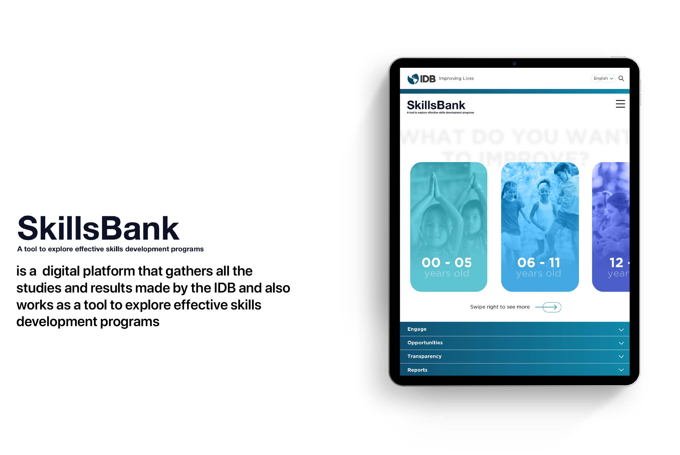
Skills Bank: A tool to explore effective skills development programs
The Inter-American Development Bank
01Introduction
Despite governments’ best efforts, many people in Latin America and the Caribbean don’t have the skills they need in order to succeed in different social, academic, economic and professional environments. This app draws together the “do´s” and “don´ts” regarding the implementation of different programs and policies that can easily be searched by governments in their quest to help their citizens improving their life quality.

02The Problem
As you can imagine the IDB has huge pools of information, data and case studies which leads us to a primary problem: how are we going to organize all of this info in such a limited space? For instance, in the previous platform, it could take up to +2 weeks for users to find what they need. In this sense, our main goal was for the user to be able to find any useful information in less than 2 days.
Additionally, there was another tiny -not that tiny - problem: the client didn’t want literally any colour in the user interface.
03Research Process
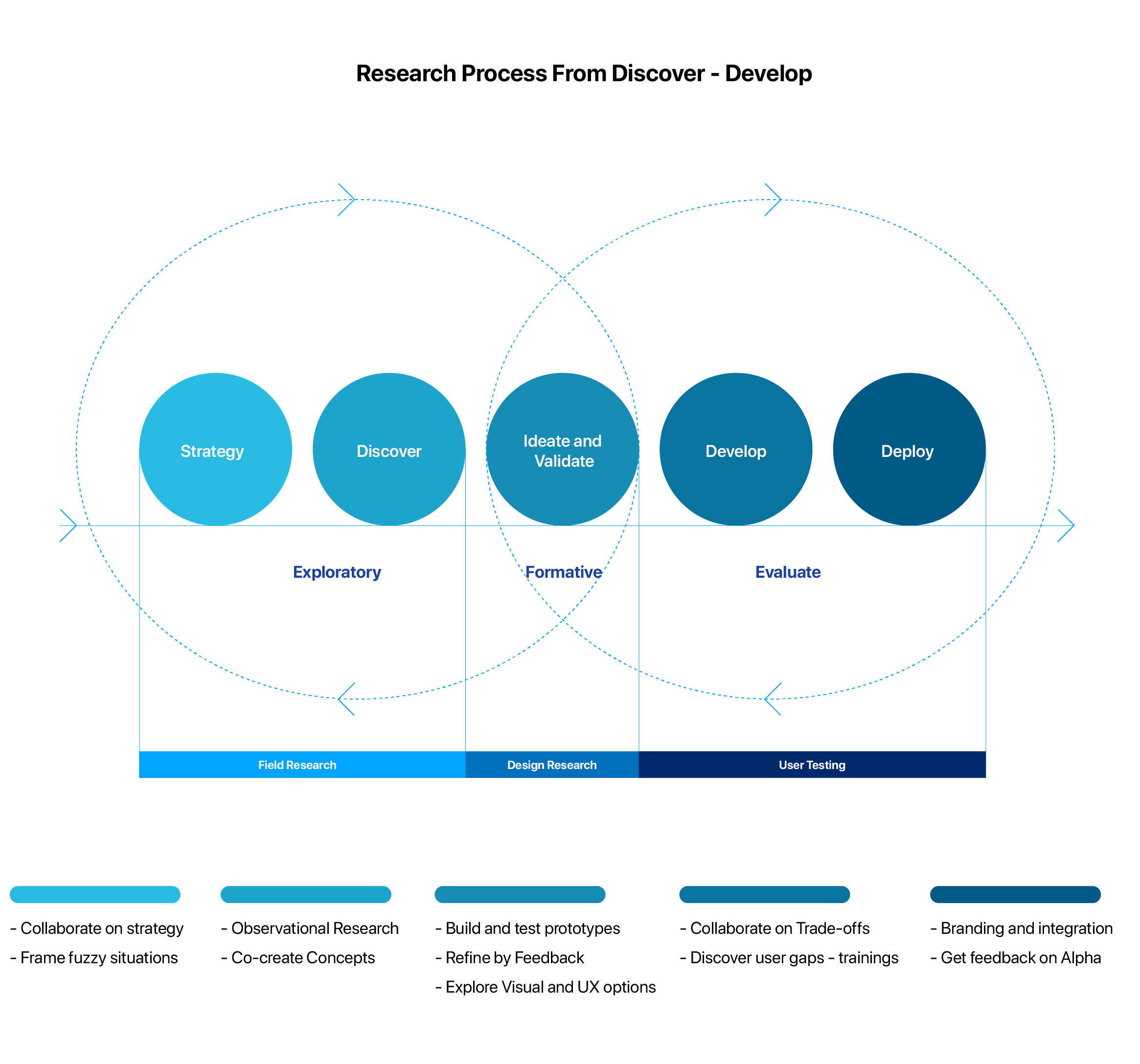
Me and my team started to do the research process based on all the data that the bank provided and looking to see if the competitors already had something similar in the market.
After gathering all the information, we mapped out an end-to-end user journey of a government’s employee to visualize areas where pain-points might arise. After overviewing the research experience, we synthesized an initial hypothesis that governments’ employees tend to look at tables and statistics rather than the text itself.
To understand the problem scope and the research experience from both sides, we conducted 5 semi-structured interviews with the IDB specialists and government’ employees and created an online survey that got 42 respondents.

04Ideate and Validate
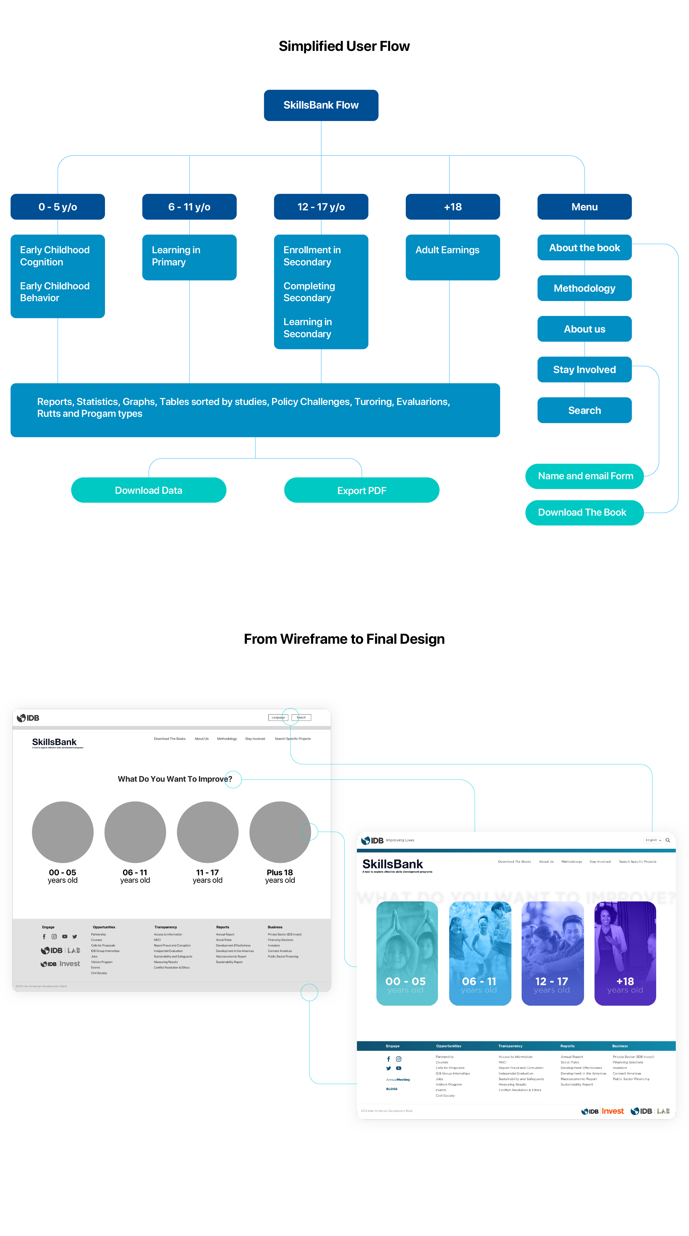
To test our concept, we created paper prototypes that demonstrate key user flow. The paper prototype allowed us to brainstorm on main features without expending too many resources. We iterated on our wireframe by conducting guerrilla usability testing with paper prototypes. With a total of 8 participants, we aimed to validate the solution concepts, clarity on components, and user efficiency.
We iterated on our paper prototypes by conducting guerrilla usability testing with 8 participants. We recruited our participants in the IDB offices, where the app and website would be likely to be used. The goal was to test the solution concept, clarity of components, and user efficiency. The participants gave great feedback including concerns about edge case scenarios. Unfortunately I forgot to take photos of the paper prototypes and that's why you won't find any pictures bellow.

05Visual Design
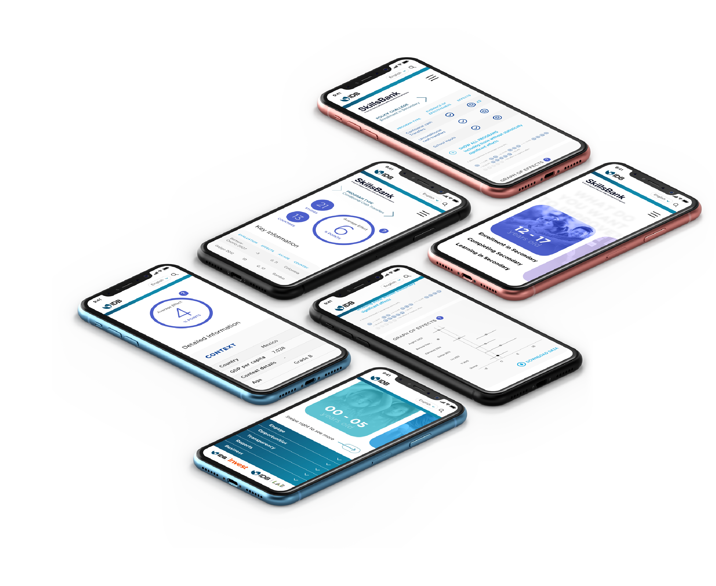
We started designing high fidelity prototypes by creating a style guide for the user interface and determining major screens of the website first - this was a client requirement - as we usually design mobile first. We used Sketch for UI design and Principle for motion design.
In this phase, we had to resolve our last tiny not-that-tiny issue, the non-color interface. After 5 attempts to design an appropriate black and white interface we determined that it wasn’t a viable option, thus we collected all the pros and cons (basically there were just cons, to be honest) and presented it to the client. After a 5 hours meeting - no exaggeration - they understood the problem and agreed to use 2 colours (blue and purple)


06The Result
Since the app and website were launched the BankSkills has received 10x more downloads and tons of positive feedback on how the product has helped users save time.
Furthermore, the IDB wrote an amazing book-based database that accompanies the digital platform, aggregates evidence on skills development policies throughout the life cycle.

07Project Learnings
Collaboration is key: The more eyes on a design, the more it’s exposed to varying opinions, experience, and critique — and this can only ultimately improve it. Or at the very least, test it.
Process in essential: For a project this vast, it gives you a roadmap to navigate through what can be a foggy route. This is especially useful when you’re starting out.