01Introduction
Resourcify is a personalized digital disposal assistant. It gathers all your commercial waste, sites, disposers and organizes them in one app, making the recycling process way easier. The app also helps companies of all types and sizes to digitize their waste management.

02The problem
They had a very strong user experience but they needed help with the user interface of the app. In the beginning, I thought it would be a really smooth project considering all the user experience was already done. Nonetheless, it was incredibly challenging to combine the good practices of UI with the existing UX.

03Visual Design & Prototyping
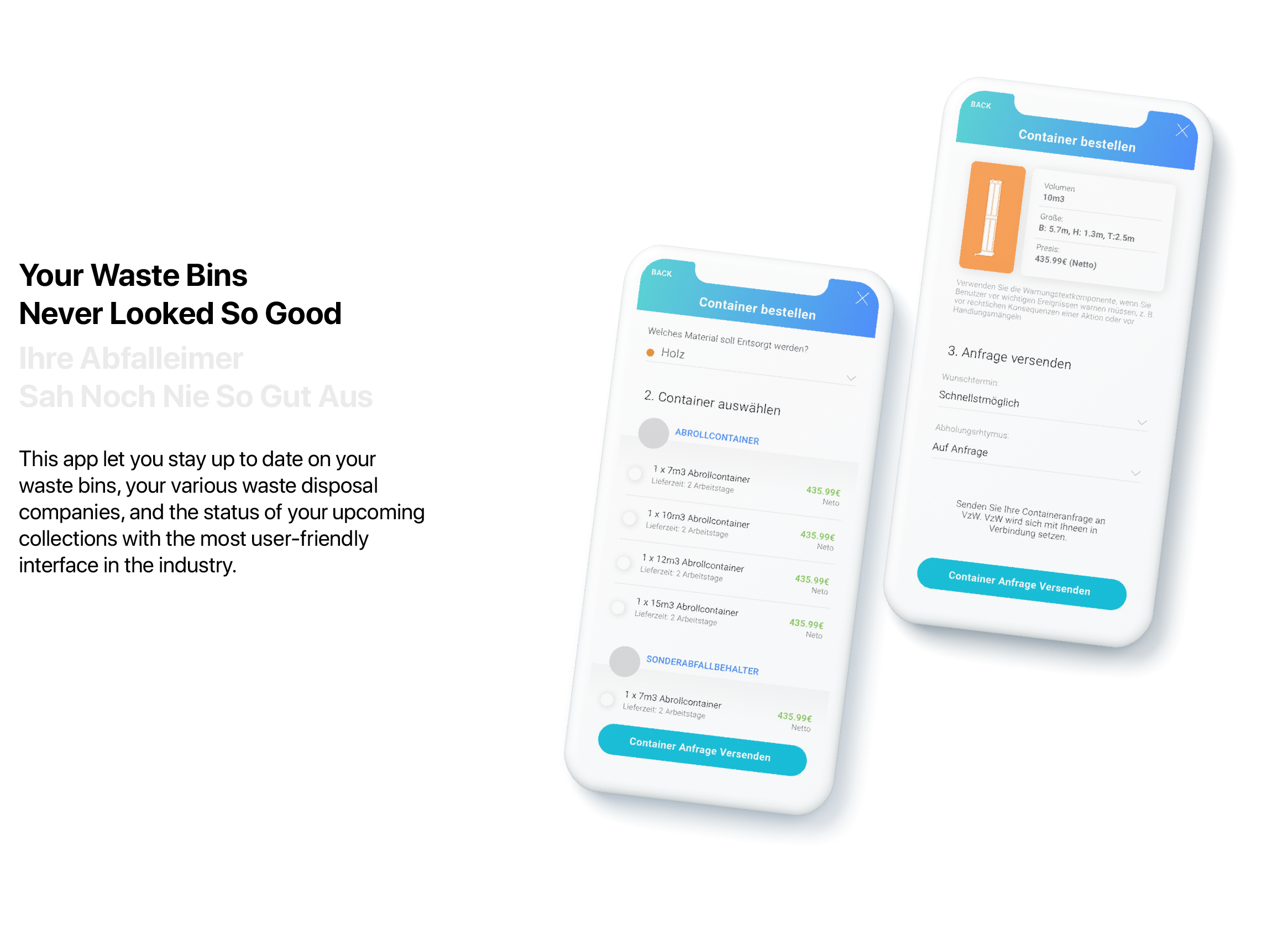
Once the client gave me all the flows, wireframes and architecture of the information, I started working on the first concept of the app. I was inspired to embrace iOS9´s guidelines and don't do much custom control in order to save time in the development phase. It needed to be light and warm, use clear typography, and focus on content.
Then I started the UI process. I started with the most important pages and went from there to the least important ones. Since the constraint of the project didn't let me spend a lot of time exploring things, I skipped the low-fi and went straight to the hi-fi wireframes (more like an early version of the design mockup). I used the Sketch app since it lets me measure things effortlessly.
Once most of the screens were there, team members provide constructive feedback based on agreed user flow. Later, we came up with some feedback to improve the app. To save time in the tight deadline, instead of doing the improvements on the hi-fi wireframes we decided to incorporate the improvements on the final design.
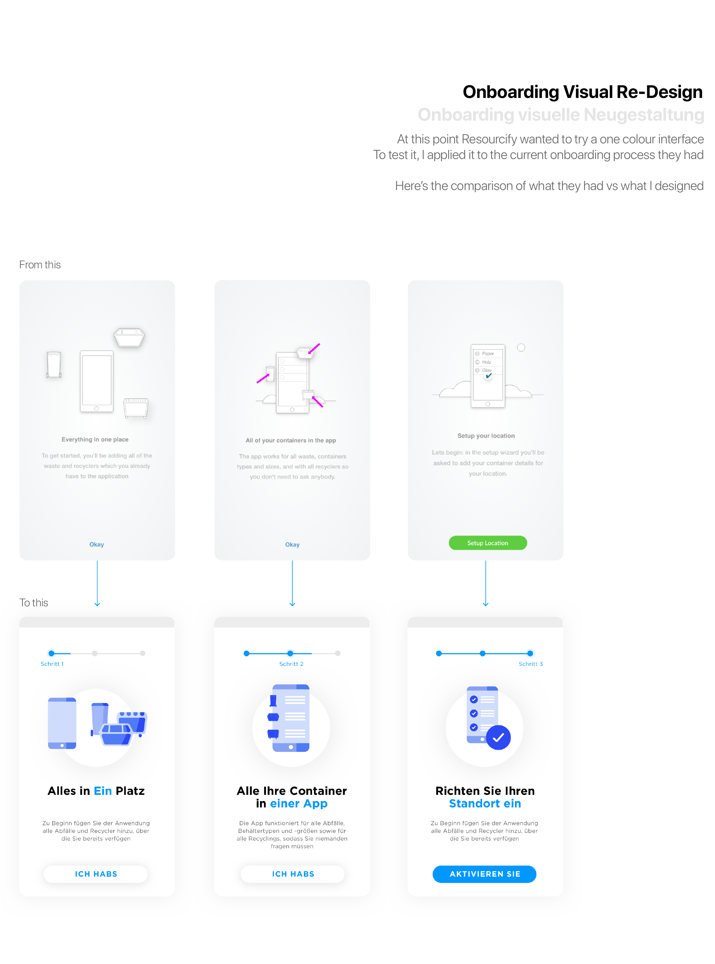
To design the final mockup we needed to set the tone of the app that reflected the brand of the product. Since the app didn't have this set yet, I created a quick simple brand guideline to ensure all the design process will follow the guides and become more consistent.

04Project Learnings
- As a freelancer, it's important for you to balance between different features according to timeline and budget. Make sure you make an efficient design decision.
- Collaborating and communicating is always vital in every aspect of the design process. When the devs need your support and guidance, be available for them because they're the people who are gonna make your design come to life.