01Introduction
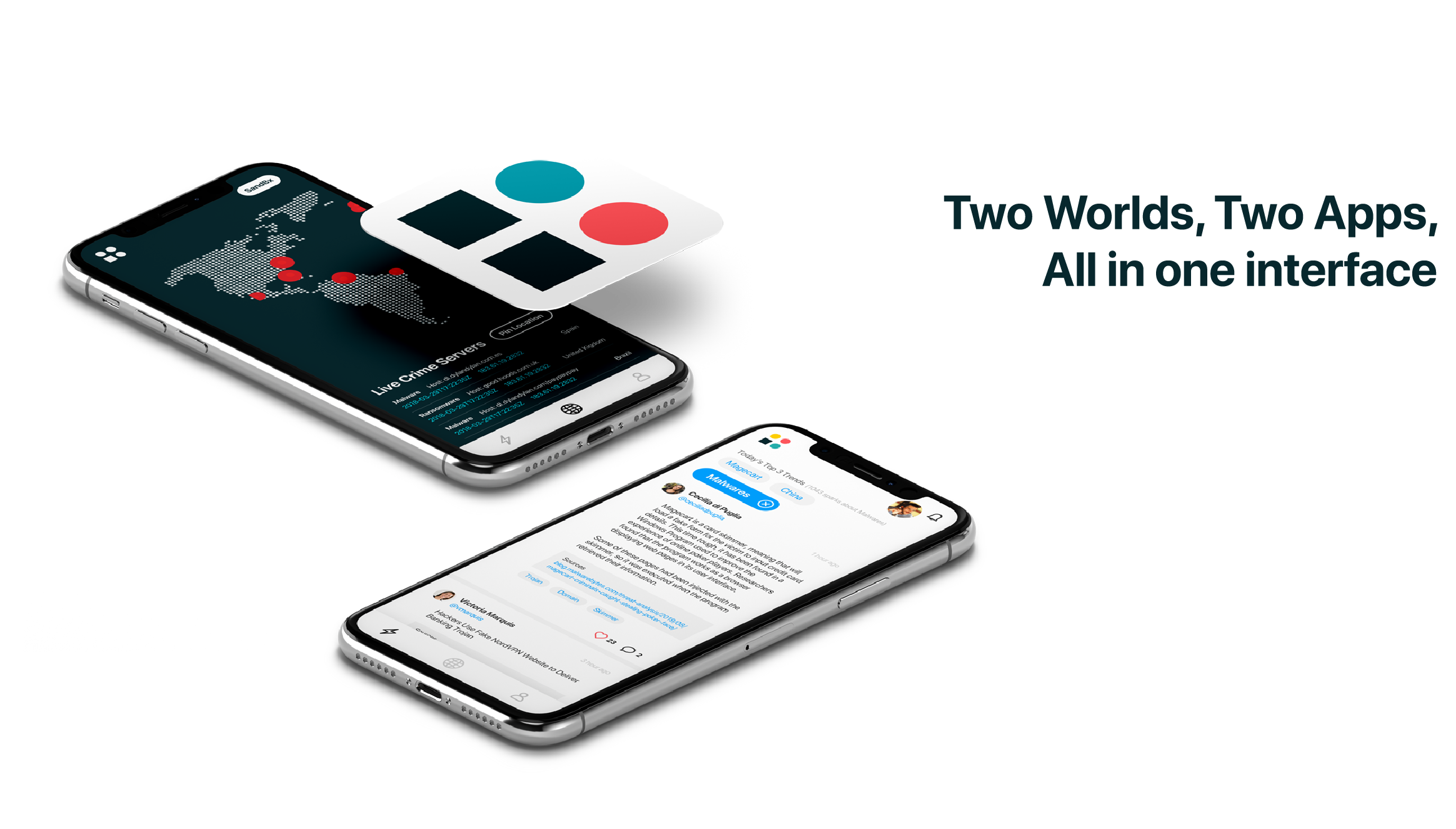
Blueliv is a leading cyberthreat intelligence provider. In 2017 they decided to turn its focus into social networking. They scour the open, deep and dark web to deliver fresh, automated and actionable threat intelligence to organizations, helping protect their networks from the outside in. They also enable organizations to save time and resources by accelerating incident response performance, providing user-friendly evidence accessible to all levels within cybersecurity operations teams with our pay-as-you-need solutions.
Blueliv’s Threat Exchange Network is designed to protect your enterprise and the community against today’s latest threats. By providing expert threat data, Blueliv Community allows you and your peers to improve incident response and get recognized.

02The Problem
The company wanted to design an app that could be both a social network and an interactive map where users could see live all cyber attacks in all the continents. When the project was first handed to me they already had some designs and user flows, but that was precisely wat they DID NOT wanted. These user flows and maps were -in my opinion- in really good shape, however Blueliv needed to changed them completely.

03Research, Ideate and validate
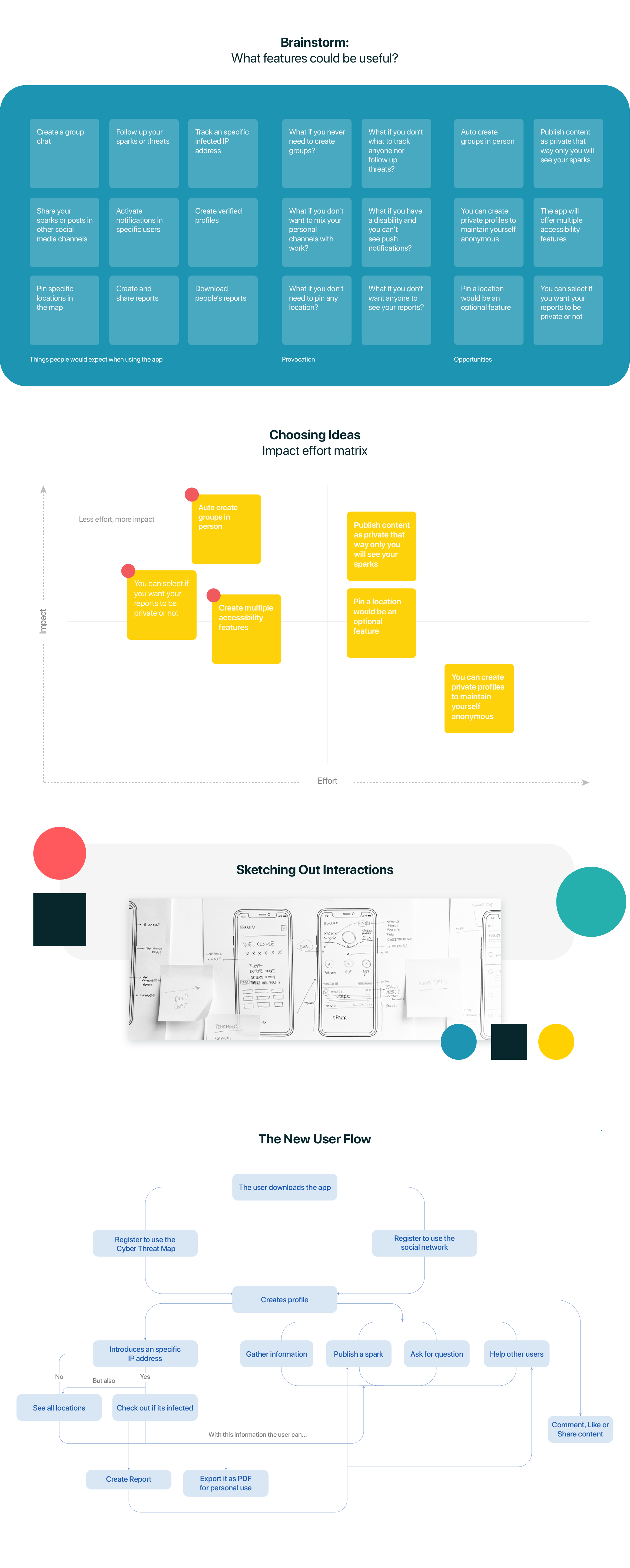
I didn’t have any type of familiarity with the topic so the frist step was educating myself. When I fully understood most of it I asked them more data thus I could create some personas and a more accurate user journey.
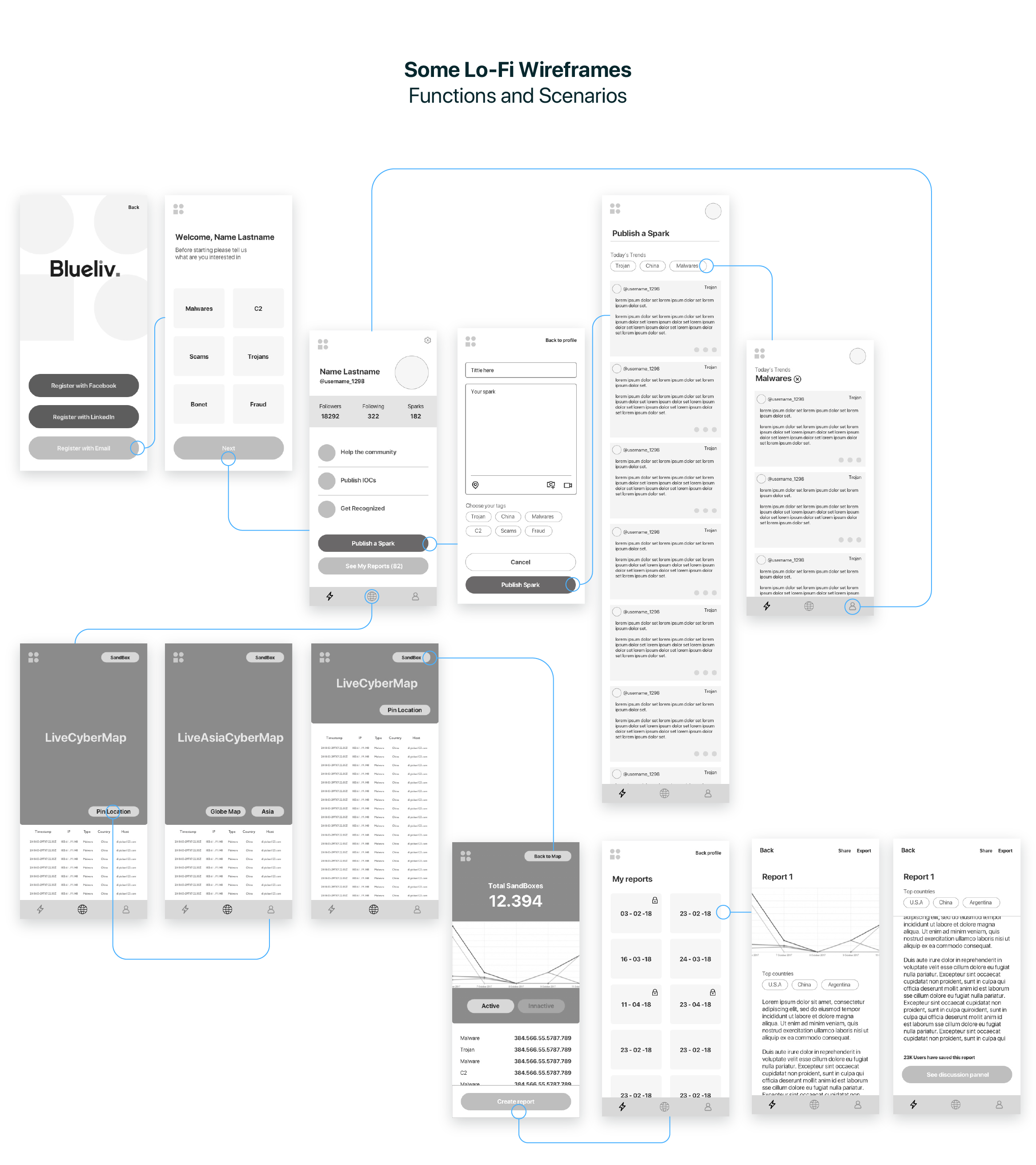
To test our concept, I created paper prototypes that demonstrate key user flow. Paper prototype allowed me to brainstorm on main features without expending too much resources. I iterated on our wireframe by conducting guerrilla usability testing with paper prototypes. With the total of 10 participants, we aimed to validate solution concept, clarity on components, and user efficiency.

04Visual Design & Prototyping
One of the main goals was scalability. At the moment of the launch, we had only two sources of data: the map and the threats. The design solution should be flexible enough to easily add more sources of data: reports, sandbox, statistics and more. I conceived of a cards-based interface. By using them, we were able to add more and more data sources in a very easy way, virtually without any limits.
We started designing high fidelity prototypes by creating a style guide for the user interface and determining major screens of the website first - this was a client requirement - we usually design mobile first. We used Sketch for UI design and Principle for motion design.

05Project Learnings
- Don't spend too much time on refining things before everyone agree. I did these mistake where I was too focus on refining one hi-fi wireframes. Limit the wireframes and aim for function.
- Make sure hire in-house developer. We spent lot of time managing, communicating, & assisting the development of the app. This make the development take long time. Hire great developers where they can implement your idea and supportive. No matter how good, how fancy, how neat you design the interface & interaction; if you can't get a good developer, this will not likely happen.